
When taking a brief from a client a designer will always present a variety of routes, more often than not, we already know which one is the best option, but does the client?
Presenting too many ideas
Of course, you can’t just show one idea, it’s over confident and arrogant, but presenting as many ideas as you can is not a necessarily a good strategy either.
So you've finished constructing a presentation, everyone is feeling really positive and it looks great. It shows five different ideas, with each route having a clear and well-presented thought process including inspiration examples. You all look through it one last time and all think, ooh, I really hope they pick route three... maybe we should show it first? No... we should show the safest route first, that's it... show a progression from evolution to revolution. Oh but route three has that perfect balance. Hmmm.
Guess what?... they picked route two... and a bit of route five.. and the typography from route one. Oh well, it will still looks good (but not as good as route three).

Inspiration for colours and typography
Too many ideas, not enough focus
This method of presenting multiples of ideas, a smorgasbord, is a format that clients can understand, it is the tried and trusted formula for many agencies and from some perspectives, the more ideas the better. But by showing so many options, you’re always going to have solutions that work better than others which can be quite overwhelming and bamboozling for the client, while also unnecessarily time consuming for the design agency…. and why present solutions that don’t quite have the same impact or answer the brief as well as others?
Another very common scenario is when a preferred route is chosen, parts from other ideas are mixed into the final idea. This can feel like a collaborative process but it’s not – the final solution a lot of the time is brought about in a rush by time constraints and the frustrations that follow are a compromise and a mish-mash.

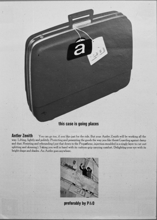
Inspiration for a graphic/simple illustrative route
It’s them not us…
The designer/client relationship collaboration can really be more transparent by honouring the creative competency of everyone involved, where everyone, particularly them, the client, are taken on the creative journey. Designers have the resources and the experience to find the right inspiration that will engage and provoke discussions for what is right or wrong for the look and feel, or for what encompasses the brand values. Not to sound exasperated and a tiny bit long in the tooth about it, but we are spoilt with an abundance of online reference databases, that’s not to say the inspiration should only be found on the internet, but it’s never been easier to construct definitive design routes, solely by stimulus examples.

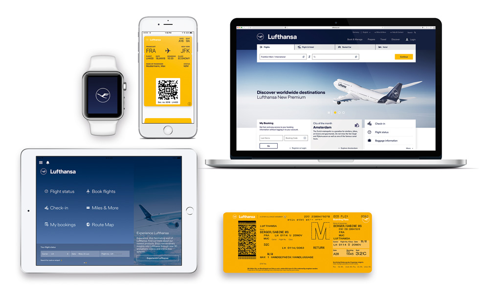
Inspiration for a definitive photographic style.
An initial presentation could be solely driven using only inspiration examples, but it should have clear design routes in the form of layout design, graphics, illustration and photography. Let there be a discussion of why the client warms to or rejects certain visual aspects. This discussion point will go a long way to understanding what your client likes or dislikes, so by the time you are developing actual design solutions in the next presentation stage, you know that there is no need to show so many ideas. You are confident that anything presented will be positively received and that all you will really need to decide from assessing the reduced amount of routes, is how evolutionary or revolutionary the design will be.
In conclusion…
When we work with our clients we always ensure they are involved with the design process at every stage, so that instead of choosing the second best idea or a combination of ideas, they choose the one that we know will work best for them.
Contact me if you’d like to discuss your brand design requirements or subscribe to my newsletter for regular updates on how to work with designers, top tips and workbooks.
Follow & share
If you liked this post and want to see more of the same, subscribe to follow the blog and feel free to share it on your social media platforms. I love hearing other people’s perspectives so join in the conversation and comment below. You can follow us on Instagram here.